Visual Identity, Website design & developement
For a consultancy dedicated to equity, diversity, and inclusion


Visual Identity, Website design & developement
For a consultancy dedicated to equity, diversity, and inclusion


Visual Identity, Website design & developement
For a consultancy dedicated to equity, diversity, and inclusion


Two cups, one with black coffee and one with regular milk coffee - showing diversity through imagery

VIVIDHATA

VIVIDHATA

VIVIDHATA

Brand Identity / Collaterals / Website Design & development

Brand Identity / Collaterals / Website Design & development

Story

Story

Story

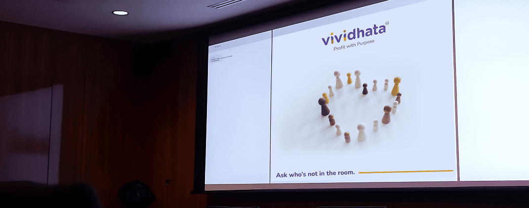
Vividhata, meaning diversity in Sanskrit, is the dream project of Arti, an accomplished physicist and a passionate advocate for building equitable workplaces. With roots in both India and Australia, she has long believed in the philosophy of Profit with Purpose - that businesses should not only thrive financially but also foster equity, diversity, and inclusion (EDI) at their core.

When Arti approached me, it wasn’t just about designing a logo or website - it was about crafting a brand identity that itself embodied inclusion. From the visual identity and visiting cards to the website design and development, every detail needed to be thoughtfully designed to reflect the principles Vividhata stands for.

The Challenge

The Challenge

The Challenge

The key challenge was ensuring that every part of Vividhata’s brand was not only visually engaging but also truly accessible and inclusive:


  • The logo and color palette needed to be legible, distinguishable and usable by individuals with colour blindness or visual impairments.

  • Icons and imagery had to avoid gender stereotypes and feel universally relatable.

  • The website needed to comply with WCAG guidelines, making it easy to navigate, accessible via screen readers, and usable by all visitors - including those with disabilities.

  • Additionally, this was Arti’s first major step in publicly presenting Vividhata, so the brand needed to feel approachable, human, and professional.

The key challenge was ensuring that every part of Vividhata’s brand was not only visually engaging but also truly accessible and inclusive:


  • The logo and color palette needed to be legible, distinguishable and usable by individuals with colour blindness or visual impairments.

  • Icons and imagery had to avoid gender stereotypes and feel universally relatable.

  • The website needed to comply with WCAG guidelines, making it easy to navigate, accessible via screen readers, and usable by all visitors - including those with disabilities.

  • Additionally, this was Aarti’s first major step in publicly presenting Vividhata, so the brand needed to feel approachable, human, and professional.

The Solution

The Solution

The Solution

Vividhata logo on a board

Visual Identity – Simplicity with Purpose

Visual Identity – Simplicity with Purpose

The logo had to be neutral, friendly and immediately understandable to all.

Inspired by brands like Logitech and Mastercard, who moved towards lowercase typography to soften their identity, I applied the same logic.

Using a lowercase font, the logo feels approachable and human - reflecting Vividhata's mission to simplify and demystify complex EDI concepts.
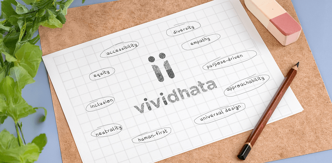
Vividhata logo breakdown

Logo Details:

Two neutral human figures, subtly forming the ‘i’ - designed free of gender cues.
The figures stand for awareness, inclusion, and equality.

Color Palette:

Purple, Pink, and Yellow - chosen using a colour blind -friendly chart, ensuring high contrast and visibility.
These colours visually represent energy, empathy, and balance, core to the brand’s message.
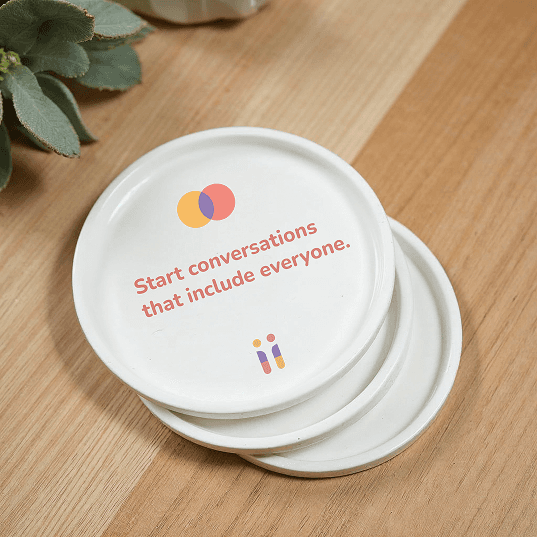
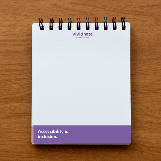
COlor blindness chart

Ask who’s
not in the room.

Ask who’s
not in the room.

Design for everyone,
not just the majority.

Design for everyone,
not just the majority.

Accessibility
is inclusion

Accessibility
is inclusion

Inclusive Brand Collateral

Inclusive Brand Collateral

Visiting Cards:

  • Designed with braille-printed information to make essential details accessible to individuals with permanent blindness.

  • Visual simplicity maintained, with the brand colors and neutral icons.


Overall Visual Language:

  • Minimal, clean, universally relatable.

  • Icons free of stereotypical representations—focused purely on neutral, human-first visuals.

Visiting cards with braille
Presentation background with text 'Ask who's not in the room.'

Designing a brand that reflects its values at every level.

Presentation background with text 'Ask who's not in the room.'

Designing a brand that reflects its values at every level.

Presentation background with text 'Ask who's not in the room.'

Designing a brand that reflects its values at every level.

Presentation background with text 'Ask who's not in the room.'

Designing a brand that reflects its values at every level.

Coasters with text 'Start conversations that include everyone.'
Notepad with text 'Accessibility is inclusion'
Coffeetable book with text - No one left behind

Website Design & Development

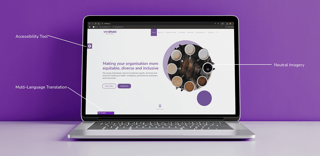
Vividhata’s website was not just about information - it was about creating a digital space free of barriers. This was also the first website I developed end-to-end, and accessibility became the guiding principle.

Key Features:

WCAG Compliance:

Integrated accessibility plugins offering:

  • Text resizing, grayscale toggle, high-contrast mode

  • Full keyboard navigability

  • Clear headings, readable fonts, and structured content

  • Proper alt-text for all images

  • Screen reader-friendly design


Multi-Language Translation:


A built-in translator allows visitors to access content in various languages including Arabic, Chinese, French, Dutch, German, and more.

Simple, Minimal Layout:


The website design follows the brand's approachable and human identity—no clutter, clean navigation, strong contrasts.

Vividhita website open on a laptop screen

We wanted to avoid the mainstream visuals of “coloured hands” often used to represent diversity. Instead, we searched for something more universal yet fresh.

Solution:

The hero section features an image of coffee cups in varying shades - from black coffee to milky coffee - symbolizing diversity in a relatable, everyday way. It's subtle, warm, and carries the message without clichés.

Vividhita website features
Vividhita website accessibility score - 100
Website features - accessibility tools and language options
Vividhata website design

LET'S CONNECT

where I will start posting...
soon

Email

parthdamani03@gmail.com

Phone

+91 96191 32010

LET'S CONNECT

where I will start posting...
soon

Email

parthdamani03@gmail.com

Phone

+91 96191 32010

LET'S CONNECT

where I will start posting...
soon

Email

parthdamani03@gmail.com

Phone

+91 96191 32010

LET'S CONNECT

where I will start posting...
soon

Email

parthdamani03@gmail.com

Phone

+91 96191 32010

LET'S CONNECT

where I will start posting...
soon

Email

parthdamani03@gmail.com

Phone

+91 96191 32010