Refillable is a sustainability-focused brand that lets you refill your daily-use cleaning liquids like hand wash, dishwash, floor cleaner, and more - right at your doorstep. Their unique model sends out a refill truck to societies and colonies, turning everyday spaces into small, moving refilling stations.
The concept was simple but powerful: use the same bottle, over and over again. And by doing that, households could avoid throwing away dozens of plastic bottles each year. No more buying new packaging. Just refill what you already have.
I worked with them to build the truck’s outer design, visual communication, and product pouch packaging - ensuring that the message came through clearly, even to someone seeing the truck for the first time.
Truck Design:
One of the main challenges was making sure people immediately understood what the truck was for. This wasn’t a delivery truck or a food van—it was a moving sustainability message, and the design had to say that upfront.
Another challenge: the truck was already green, and we couldn’t repaint it. So I had to make the visuals stand out while working within that constraint.
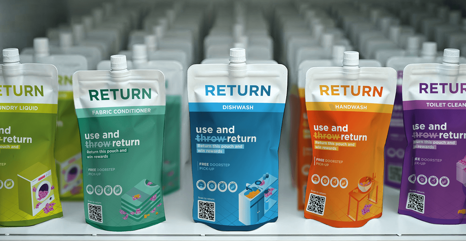
Packaging:
On the packaging side, the issue was clarity and habit. People are used to “use and throw.” This brand needed to say “use and return”—and not just say it, but help people believe in it. We also had to make rewards and returns visually clear, even on small pouches.
On both sides of the truck, I used big block typography with clear, direct phrases:
Refill Cleaning Detergents Today
Don’t Buy Another Plastic Bottle
Large illustrations of cleaning bottles and a simple refilling graphic helped show how the system works at a glance. And on the back the client gave a very bold line:
It’s just one bottle —7 billion people
The color palette stayed true to their original purple and white identity, which paired surprisingly well with the green base of the truck.


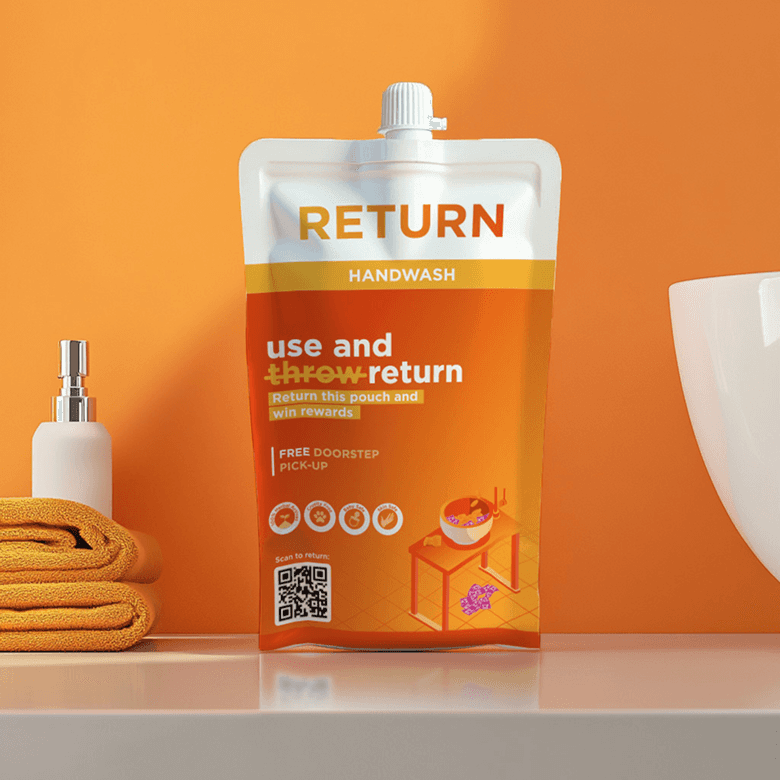
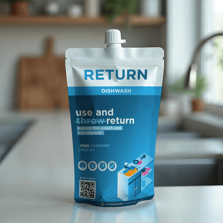
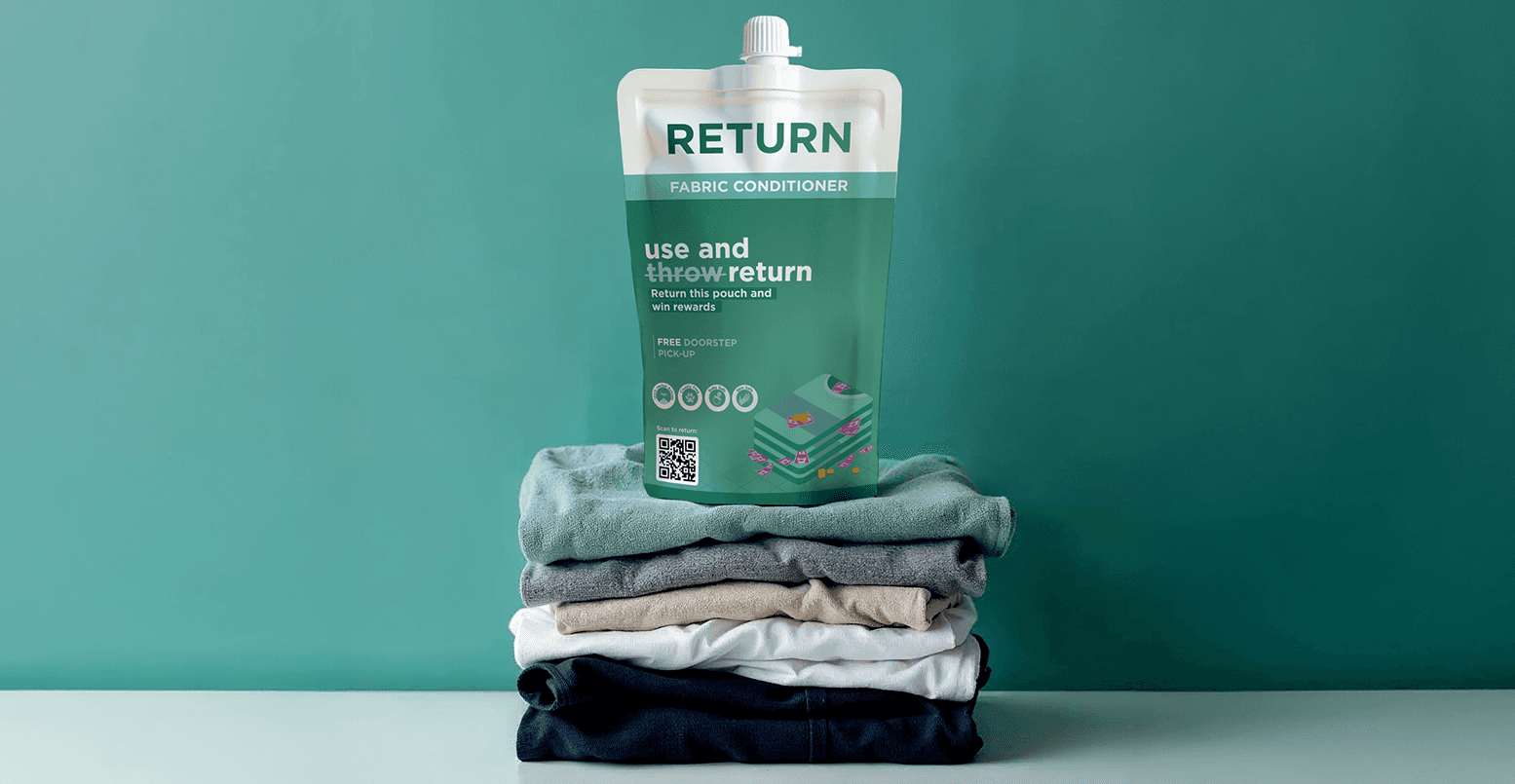
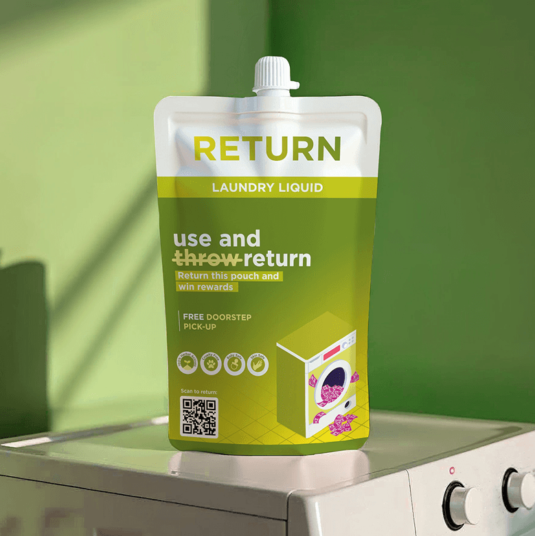
For the pouches, the key idea was: Use and throw → Use and return
I leaned into this concept by literally crossing out the word “throw” and replacing it with “return” right on the front of the pouch—so the message became immediate and clear. The brand name “Return” alone wasn’t enough to change perception, but this helped drive it home.
Each product type had its own color and custom isometric illustration.
To tie in the reward incentive, I added coins and notes flowing through every illustration. So in each scene, whether it's a sink or a t-shirt, there’s visible value—literally. It was a subtle way to tell people: refilling pays off.