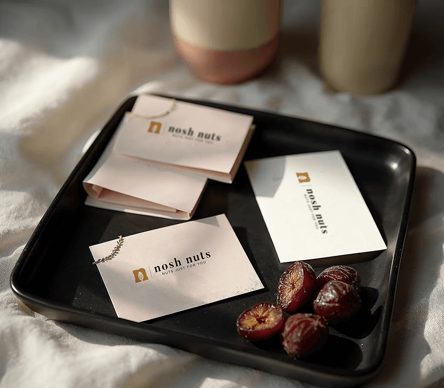
Back in 2021, the team behind Nosh Nuts approached me with a simple but sharp goal: create a clean, premium-looking brand to sell dry fruits. They already had the name, and wanted everything else—logo, packaging, visiting cards.
The aim was to stand out in a category that's often loud or overly traditional, and instead go for something more modern and high-end.
The biggest design challenge here was how to create something that felt premium, while staying minimal, shelf-ready, and easy to expand across SKUs.
Dry fruits aren’t new—but the experience around them could be. So the identity had to reflect quality, while also being approachable.
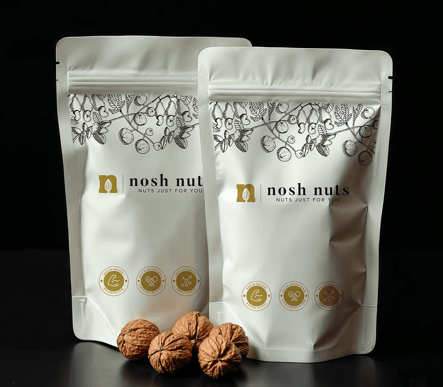
The brand direction leaned entirely into minimal, premium design—a black-and-white packaging system with clean serif typography, a simple logo, and a strong shelf presence.
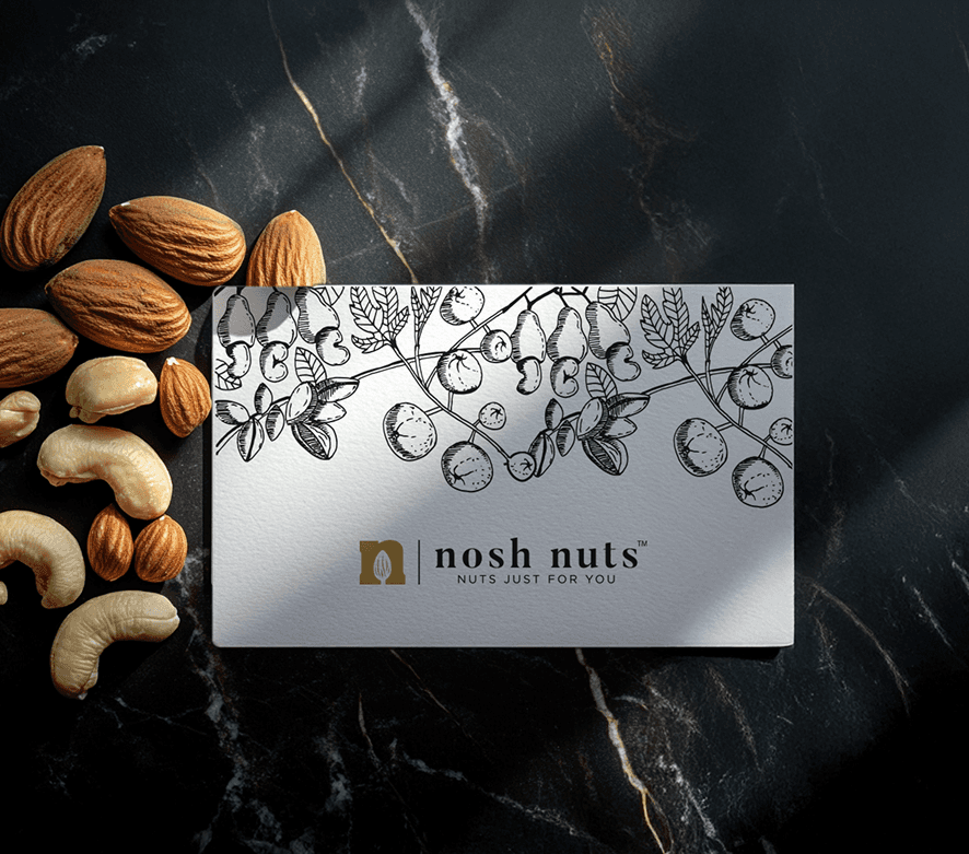
For the logo, I created a monogram using the letter N, with an almond placed inside it—subtle and product-relevant. The font was a modern serif, chosen for its elegance and timeless feel.
But what really brought the packaging to life was the hand-drawn botanical illustrations. I researched the actual plants - cashew, almond, and others - and illustrated them by hand to give a sense of authenticity and sourcing. The linework was used as a design layer across the packaging, adding a layer of depth and organic sophistication without overwhelming the minimal layout.
The final result felt clean, modern, and rooted—ready to stand out quietly.