Visual Identity, Packaging & Website design
for a tea manufacturer with a legacy of over 70 years

Visual Identity, Packaging & Website design
for a tea manufacturer with a legacy of over 70 years

Visual Identity, Packaging & Website design
for a tea manufacturer with a legacy of over 70 years

Hridaan cover image with colourful packaging - orange, green and maroon. The logo has been illustated and seamlessly blended with the box colour

HRIDAAN TEAS

HRIDAAN TEAS

HRIDAAN TEAS

Brand Identity / Packaging Design / Website Design & Development / Photoshoot strategy

Brand Identity / Packaging Design / Website Design & Development / Photoshoot strategy

Story

Story

Story

When Parshva, the founder of Hridaan, approached me, he carried with him not just an idea - but a legacy. Coming from a family that had been in the tea business since 1942, he wanted to take that heritage and build something new, something personal. He needed a name, an identity, and a complete brand system that could bring this vision to life.

This wasn’t about trial and error. The product quality was already exceptional. What was missing was a brand that felt as premium, warm, and rooted as the tea itself. That’s where I came in - to create the name, visual identity, packaging, and website that would make Hridaan stand out.

The Challenge

The Challenge

The Challenge

The challenge was clear:


  1. Balancing premium with relatability. The tea flavour names (Bombay Cutting Chai, Masala Chai, etc.) carried strong, familiar associations. But the brand needed to feel elevated and premium, without losing that connection.

  1. It was Hridaan’s first step into B2C, meaning there was no room for error. The entire perception of the brand would be built through visuals alone.

The challenge was clear:


  1. Balancing premium with relatability. The tea’s flavour names (Bombay Cutting Chai, Masala Chai, etc.) carried strong, familiar associations. But the brand needed to feel elevated and premium, without losing that connection.

  2. It was Hridaan’s first step into B2C, meaning there was no room for error. The entire perception of the brand would be built through visuals alone.

The Solution

The Solution

The Solution

The Name: Hridaan – Why It Works

The Name: Hridaan – Why It Works

Naming is always tricky - subjective, emotional. But through conversations, it became clear that Parshva’s love for tea wasn’t just about the product. It was about the love he wanted to pour into every cup.

That led us to Hridaan, meaning “Gift of the Heart.”


It instantly gave the brand a personal, emotional foundation.


The name reflects:


1. The passion behind the product

  1. The legacy and care passed down through generations

  2. The belief that tea is not just served - it’s given, with warmth

Hridaan logo which is inspired by the tea picker - the real heroes behind great tea - hands joined in humility, wearing a hat with a small heart

The Visual Identity: Premium Yet Familiar

The Visual Identity: Premium Yet Familiar

The brand needed to communicate luxury without feeling distant.

 The logo is inspired by the tea picker - the real heroes behind great tea - hands joined in humility, wearing a hat with a small heart.


Surrounded by tea leaves in a circular emblem, it reflected:


1. Craftsmanship & care
2. Heritage & tradition
3. A nod to the product’s origins

The tea picker’s hands, joined in gratitude.
A symbol of the love poured into every cup

The tea picker’s hands, joined in gratitude.
A symbol of the love poured into every cup

The tea picker’s hands, joined in gratitude.
A symbol of the love poured into every cup

a smiling tea picker
Hridaan tea packet with logo in focus
Hridaan visiting cards, premium black matte finish

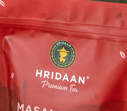
The color palette was intentionally kept black and gold - universal signals of premium quality.

For the website and accents, after discussion with the client, we introduced deep green to ground the brand, creating a balance between luxury and organic authenticity.

Logo breakdown for Hridaan

Colour Palette

Colour palette
Colour palette
Colour palette

Packaging

Packaging

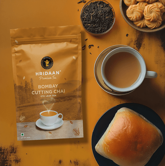
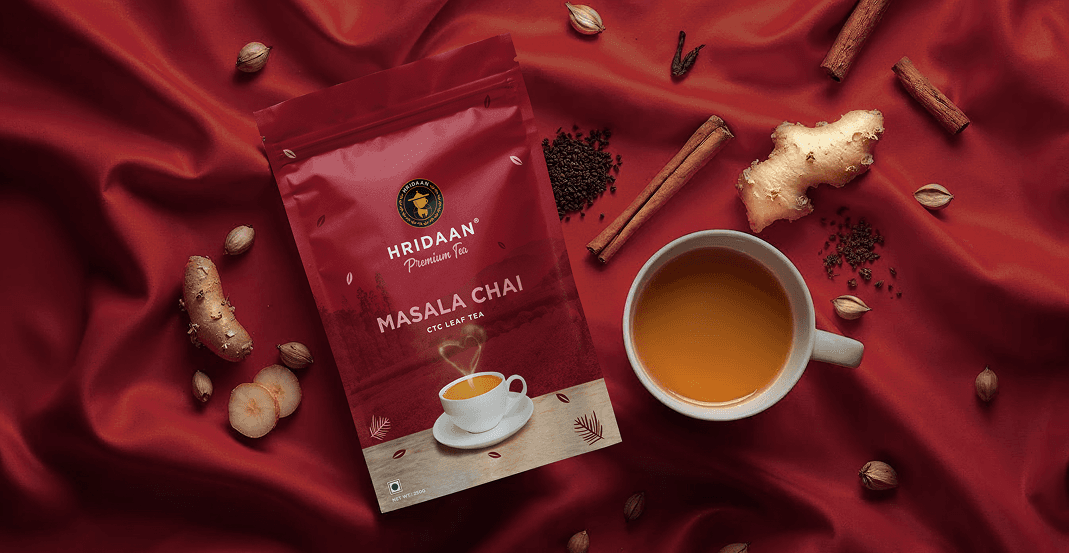
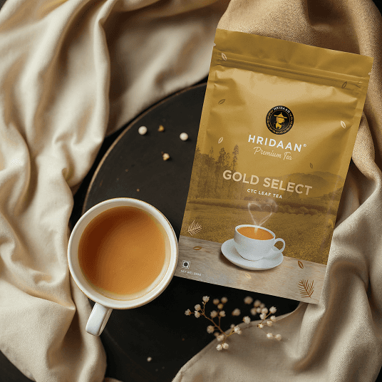
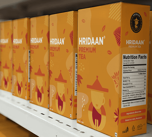
For the daily-use pouches, the packaging is simple, bold, and colour-coded by flavour:


1. Orange – Bombay Cutting Chai
2. Red – Masala Chai
3. Olive Green – Elaichi Chai
4. Gold – Gold Select
5. Green – Green Tea

Each pouch featured:


a. A prominent white tea cup on a wooden table, with steam forming a heart - making the brand instantly relatable.
b. Clean, bold typography - ensuring flavours were easy to spot.

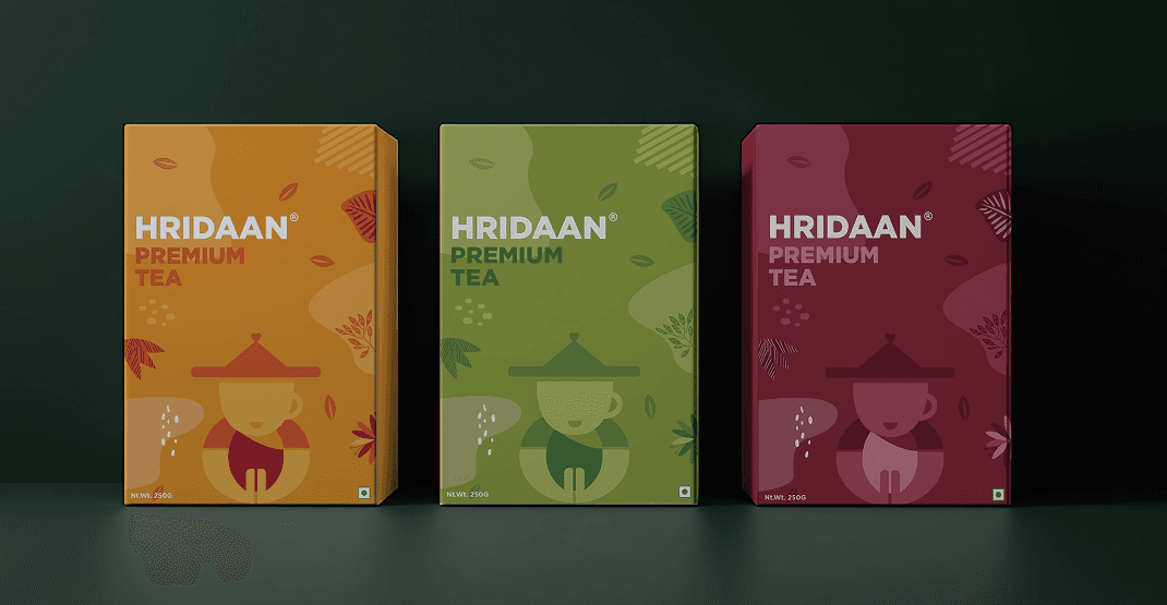
For premium gifting boxes an illustrated version of the tea picker character.

  1. This made the boxes feel more exclusive.

  2. The colour schemes matched the pouches, keeping the brand consistent across products.
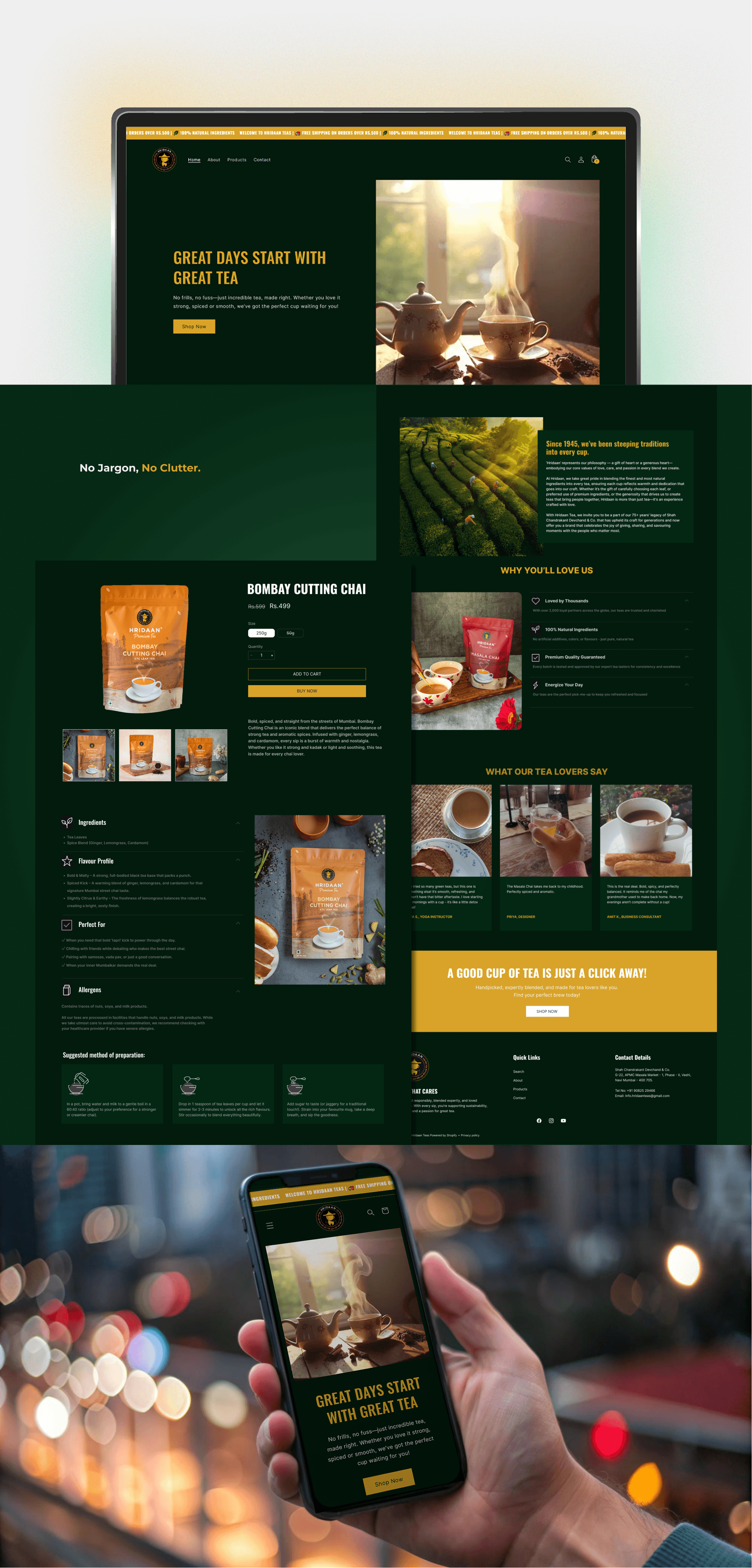
Bombay cutting chai
Bombay cutting chai
Bombay cutting chai
Bombay cutting chai
Elaichi Chai
Elaichi Chai
Elaichi Chai
Elaichi Chai
Masala Chai
Masala Chai
Masala Chai
Masala Chai
Green tea
Green tea
Green tea
Green tea
Gold Select
Gold Select
Gold Select
Gold Select
Premium Tea Boxes
Premium Tea Boxes
Premium Tea Boxes
Premium Tea Boxes

Website

Hridaan website
Hridaan website
Hridaan website
Hridaan website

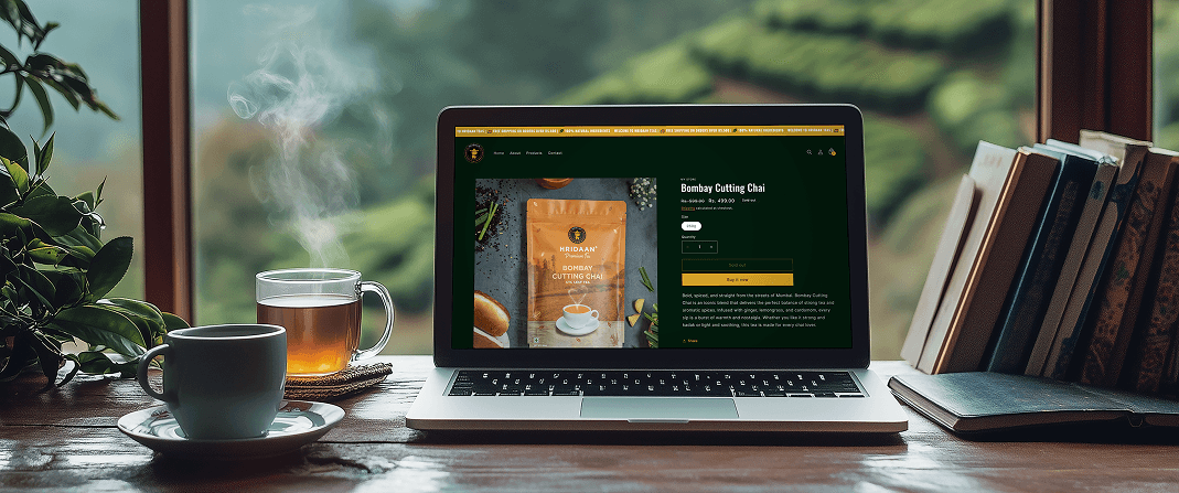
The website is designed and developed on Shopify, keeping it:

  • Minimal and easy to navigate

  • Dominated by a deep green and gold palette, reinforcing premium aesthetics

  • Product packaging was displayed with transparent backgrounds, allowing them to pop and immediately draw attention.


    Even the website content and tone reflected the brand's simplicity and quality.

LET'S CONNECT

where I will start posting...
soon

Email

parthdamani03@gmail.com

Phone

+91 96191 32010

LET'S CONNECT

where I will start posting...
soon

Email

parthdamani03@gmail.com

Phone

+91 96191 32010

LET'S CONNECT

where I will start posting...
soon

Email

parthdamani03@gmail.com

Phone

+91 96191 32010

LET'S CONNECT

where I will start posting...
soon

Email

parthdamani03@gmail.com

Phone

+91 96191 32010

LET'S CONNECT

where I will start posting...
soon

Email

parthdamani03@gmail.com

Phone

+91 96191 32010